Under the Sea: Abstract Art Journal Page with Copper/GoldFoil | Mood Board #6 June 2026
Every month we create a mood board for the members of my Facebook group Bea’s Mixed Media and More. This June, the theme is The Mood of Turquoise — rich ocean blues, teal, and all the shimmer of warm summer water.
Usually mood boards inspire imagery. But this month, I took a different route entirely: I let the colours lead me into something fully abstract.
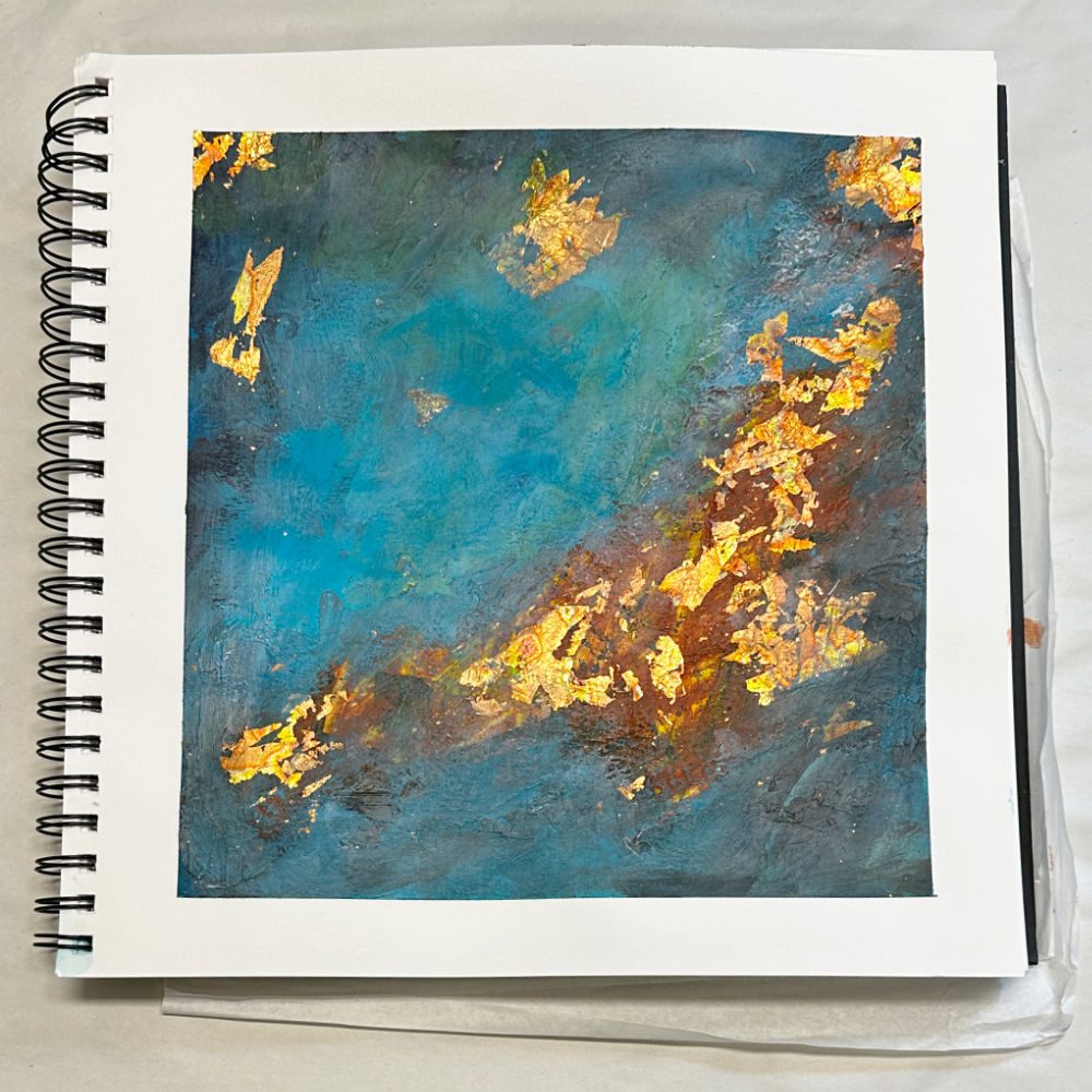
The result is a page I’ve titled Under the Sea — and it might be one of my favourites from this series.
The colour-only approach to mood boards
I often say that I’m all about colour. Strong, vibrant, sometimes neon colour. But this page reminded me how much can happen when you strip everything else away and let a palette speak on its own.
I didn’t take any images from the mood board. No seashells. No fashion. I just looked at that sea of turquoise and petrol blue and asked: where does this want to go?
The answer was down — deep and dark and glimmering. Under the Sea.
What I used
This page lives in my Fabriano Drawing Journal (30×30 cm), which is a joy to work in for journal pages that want a bit of presence.
Materials:
· Acrylic paints — turquoise, teal, petrol blue, with ochre and rust tones underpainting
· Modelling paste — for texture and depth
· Gel matt medium — very important note here (see below!)
· Gold and copper metal foils
A note on gel matt vs. gel gloss: On canvas, I always reach for gel gloss. It has a beautiful luminous quality and works wonderfully under and over foil. But in an art journal, gloss medium stays tacky — and when your journal closes, the pages press together and stick. Not what you want. So in journals I always use gel matt. It dries flat and clean, gives a good grip for foil, and keeps your pages behaving properly.
What surprised me
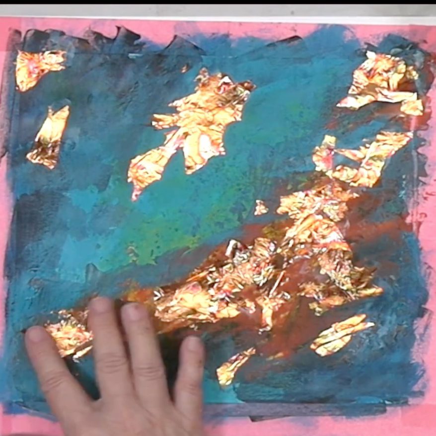
I didn’t plan the diagonal flow. I underpainting in loose teal and petrol washes, added modelling paste for texture, and then when I applied the metal foils — they naturally clustered into a diagonal line that runs from the lower left to the upper right of the page.
It felt like light hitting a reef, or treasure on the ocean floor. Warm gold against the cool deep blue. That contrast — deep teal and burnished gold — is exactly what gold foil does when it lands on the right colour ground.


Watch the process
If you want to see how this page came together, I filmed the whole process and the video is on YouTube here: