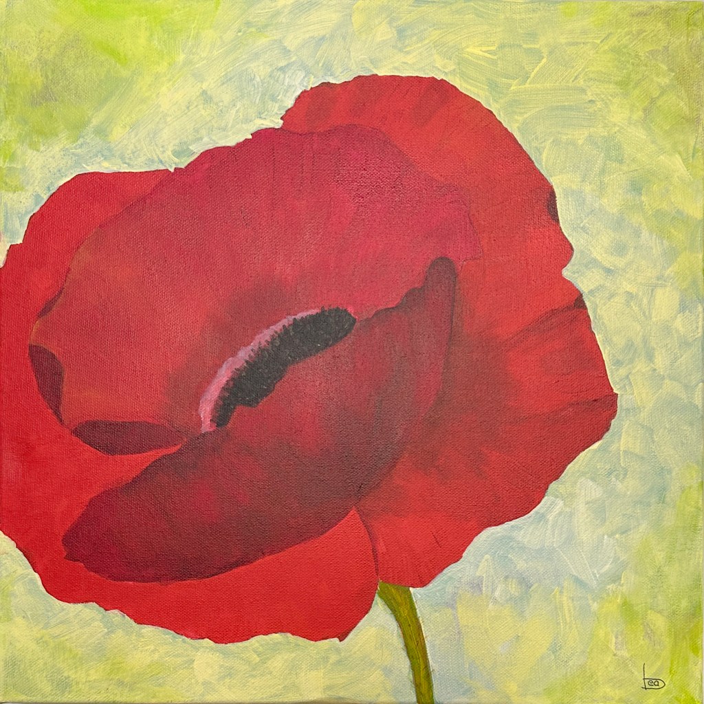
This week’s painting is all about contrasts: bold color, delicate petals, and visible strokes that bring energy and texture. I painted a red poppy—about six to seven times bigger than real life—as a quiet nod to Georgia O’Keeffe. There’s something magical about zooming in on a flower and letting the details take over.
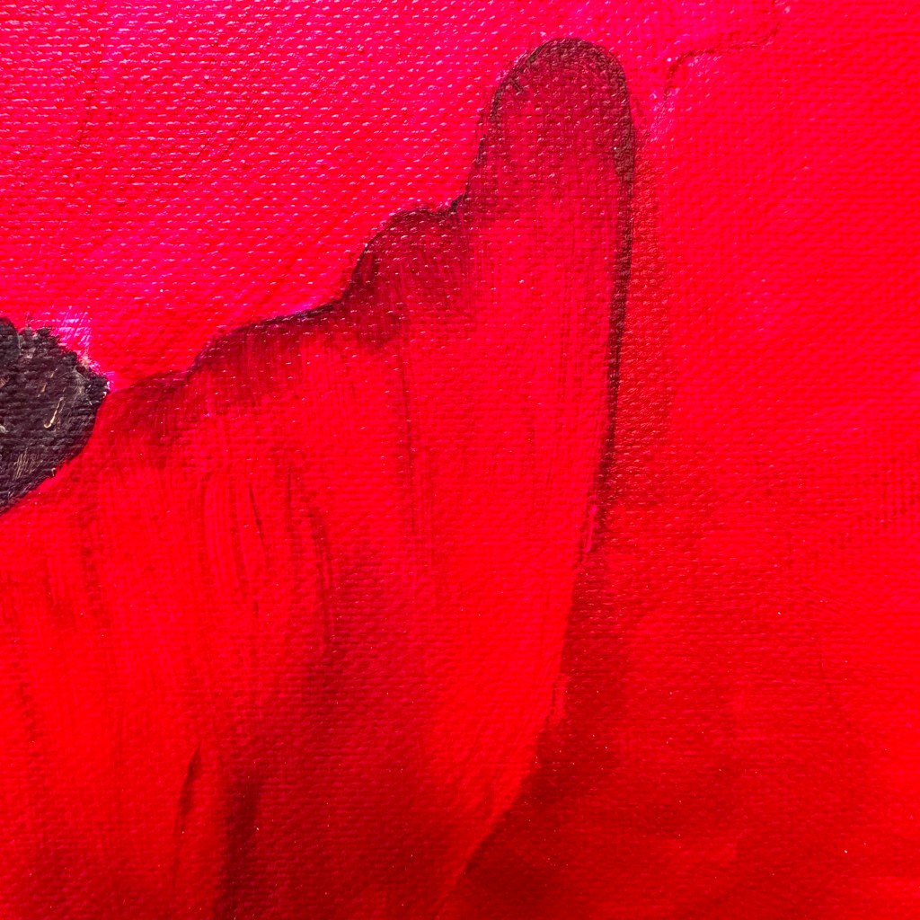
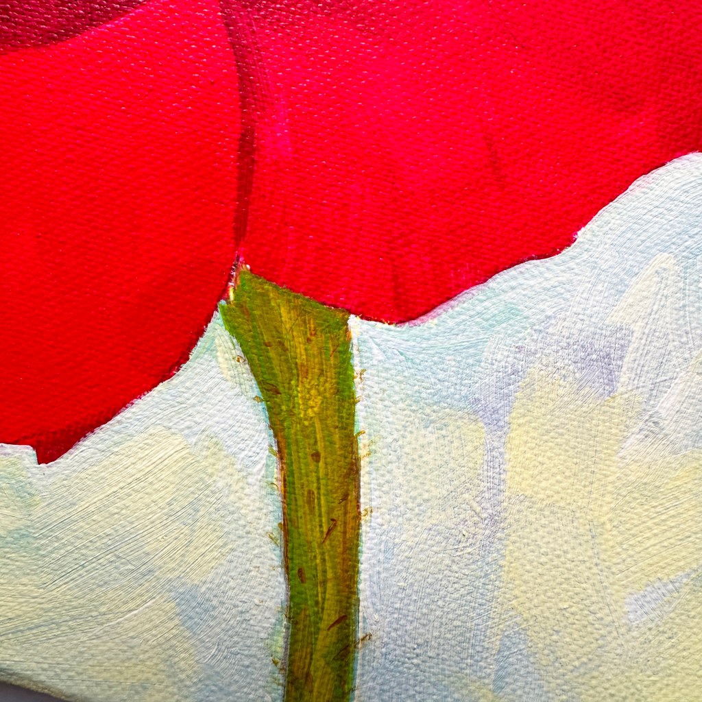
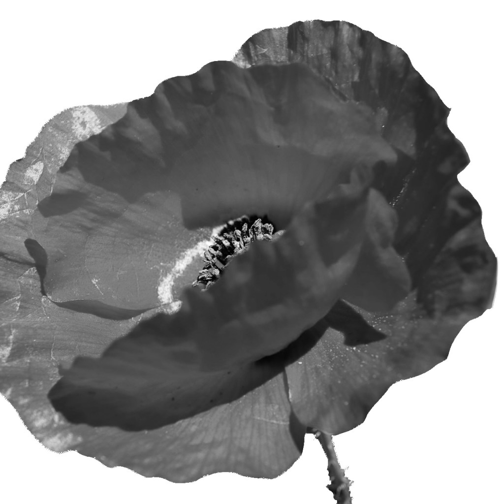
I’ve included some close-up photos of the painting below to show you what I mean. You can really see the textures. The brushstrokes are visible too. I’ve also added my reference photo, plus a black-and-white version I used to figure out where the shadows should go.
In the video, I share my color choices. I explain why I use yellow instead of white for highlights. I also show how I layer my background using short strokes to let earlier layers peek through. Plus, there’s a little trick with a black-and-white reference photo for better shadow placement.

I’ve also finally settled into my smaller studio. I’ve rearranged it for more breathing space. If you’d be interested in a studio tour video, let me know!
👉 Watch the full video
👉 Tag me on Instagram @mixedmediabeagrob if you paint your own version!

